From 1914 to 1925 the best-selling vehicle in the world only came in one color: black. Color was not the only constraint; when the Model T rolled off the line in 1908 options were not on Mr. Ford’s mind. In fact, they were antithetical to his mass production assembly line. There were some aftermarket transmissions for the ambitious and perhaps some wheel options for the adventurous but that was about it.
Today, customers have a massive amount of choice in vehicles. An overwhelming amount of choice. At last count, there are more than 150 features we interact with in a vehicle divided into at least 20 different system families. Some experts point out the potential to endlessly customize to each individual’s dream vehicle – but are more options always a good thing?
When it comes to safety, the answer is equivocally – yes. Motor vehicles were hazardous to operators and pedestrians alike when they entered the mainstream in the late 1930s with 33 deaths per 10,000 vehicles on the road. Compare that to today about 1.7 per 10,000 vehicles, a 95% improvement.
But do all new features add value?
Probably not. It is fair to say that many owners are not even aware of many features in their vehicles let alone use them. Some features are just plain silly. Rear spoilers on front wheel drive vehicles were popular in the 80s and 90s. More than a few automotive companies grafted a non-functional blower housing on “sport” editions of vehicles to make them look… well I guess “sportier”.
With the advent of software in cars, things are getting rapidly out of hand. Tesla has “emissions mode” which simulates human “emissions”, which is fun but useless. Is it necessary to know the lateral G-forces your Jeep Grand Cherokee is pulling? The Soundaktor is built into some VW models, which sends fake engine noise to the cabin when under load. It creates fake noise. In the cabin.
The feature race has replaced performance and quality as differentiators. After all, even the poorest quality vehicle in 2024 is stellar quality compared to a “Friday” car produced in Detroit in 1983. A 2024 Honda Odyssey minivan today is as fast as a 1973 Corvette. Today’s vehicles are fast and well-built so the 21st automotive new battlefield for auto manufacturers is a features race.
The Price of Feature Creep
More features are not always a good thing. First, new features aren’t free. They cost money to develop and install. Secondly, they can have unintended interactions with other systems, and it’s another system that may fail. They also can add complexity to the vehicle which can frustrate customers.
A few years ago, I interviewed a middle-aged woman who just bought a Mercedes vehicle that included their much-lauded MBUX dashboard. I asked her what she liked about it, and she admitted that she rarely used any of the features that an entire team of German engineers meticulously designed. Widerlich!
Needless complexity isn’t limited to vehicles. We can find it everywhere. Look no further than your television remote control or venture a level down in your phone interface and you might become bewildered. How many features do you use in Microsoft Word?
Here’s one: type “=lorem()” or “=rand()” on a new line in Word and see what happens. When was the last time you used Smart Art or Word Art or needed to animate your text? At some point, our technology gets overbuilt.
The Deletion Dilemma
However, designers are faced with a dilemma; if they take a feature away they will make someone angry. There was a significant backlash when automotive companies decided to remove CD players from vehicles. It turns out, people don’t like their favorite features removed and engineers are reluctant to redesign around their absence. Furthermore, salespeople and marketers prefer to talk about “adds” versus “takeaways”.
Step 1 in Pruning: Determine Awareness
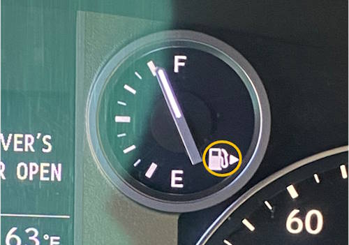
The first thing to do is to first understand what consumers are using. Learning about consumer awareness is critical and can be achieved by simply talking to customers. I am always shocked to find the number of useful features people are unaware of. For example, I was thrilled to discover the gas tank indicator on my dashboard that I hadn’t noticed for 30 years.

These helpful little features are more abundant in the software world. For example, did you know you can use your iPhone to scan text? You can, it’s quite handy.
Step 2: Determine Usefulness
The next step is to determine the perceived usefulness of the solution. Two things make something useful. First, the solution must be solving a problem, preferably an important one. Second, it must solve the problem in a way people find efficacious.
Take for instance the banana slicer.

I’m sure it slices bananas just fine, but does it solve an important problem? Enough for you to pay for it and take up space in your already crowded kitchen drawers? Probably not. It’s a well-executed solution for a non-existent problem.
There is no lack of important problems without good solutions. Getting from place to place easily in congestion-choked cities is an important problem to be solved. Introduced to enormous fanfare in 2001, Dean Kamen promised that the Segway “[would] be to the car what the car was to the horse and buggy” by bridging the gap between driving and walking. It wasn’t. Segways were too big for sidewalks, too slow for streets, too heavy to carry into offices, and too expensive for everybody.

The Segway is an example of a poor solution for an important problem. Parsing problems from solutions will help with the redesign. If you are solving an important problem poorly, then redesign is in order. If your solution is not solving a problem, it may be a temporary curiosity but it won’t have long-term resiliency.
Step 3: Take Action
With awareness and usefulness data in hand you can now make some design decisions.

If there is a feature that is not useful you need to understand whether it is not solving an important problem OR if it is just solving it poorly. If it is not solving an important problem, you probably want to get rid of it, as it is just adding cost and complexity. If you have an important problem you are addressing, but it is being done poorly, go back to the drawing board. Create a better solution for the problem.
If you have a useful feature that people are unaware of this can be alleviated by better customer education, better salesperon education, or better design. Sometimes great features are hidden layers deep in the UI. Any galley chef or mechanic knows that you keep the important and frequently used tools close and those that are less important or used less frequently further away. This is just more efficient for the end user. Eliminating feature clutter will also help your users get to the good stuff easier and faster.
Finally, if you have a useful feature that folks are aware of and use, then leave it alone. There are some apex solutions not in great need of redesign. The paperclip works very well as does the common dinner fork. Companies compelled to perpetually update designs with incremental improvements can irritate customers, especially if it involves downloading the latest update for it to function. Make sure the updates you are making, deliver enough value to make it worth the trouble for customers to learn and adopt.
Pruning Masters
Who does this well? The top of my list is the Kitchen Aid mixer. It has a simple design; just two levers. One locks the tilt and the second controls the speed. It comes with three mixing attachments that are easy and intuitive to take on and off. For the adventurous, there is a variety of very optional add-ons such as pasta makers, meat grinders, and slicers. A clean, simple, and durable design. I am sure they resisted the urge to add all kinds of pointless do-dads and add-ons over the years. It has remained largely unchanged since the 1937 Model K mixer and is still very popular. Bravo!

More recently, Toyota released a $10,000 truck. The IMV 0 comes with no screens, no radio, not power anything. Just a basic reliable truck on four wheels with a flatbed based on their indestructible Hilux global pickup platform. You can, if you like, add other accessories, but one thing you can’t do is buy one in the United States.
That’s too bad because interest is incredibly high for this vehicle with over 35 million views on TikTok. It is intended to be a base platform upon which customers drive desired functionality and options vs. engineers and product planners doing it for you.
Finally, I would be remiss if I didn’t mention the granddaddy of all pruning masters, the Google Search engine. While subsequent software adventures have strayed into complicated multi-layered UX, they pioneered less is more in search engines providing a single clean page with two search option buttons: Google Search and “I’m Feeling Lucky”. More recently they succumbed to the AI craze and added “Try AI powered overviews when you search” to their white search page.
Don’t Be Afraid to Prune
If you talk to bonsai masters, sculptors, and effective UX designers they will tell you that the art of pruning is more important and more difficult than adding features. Carefully pruning your mature product or service is just as important as the newest features. As French writer Antonie de Saint-Exupéry once said:
“…perfection is finally attained not when there is no longer anything to add, but when there is no longer anything to take away.”
Good advice. Start sharpening those shears.


